The purpose of this post is show the steps I went through from text to diagram. Turns out this a useful skill to have!)
Step 1: What data 'fields' do you want to communicate?
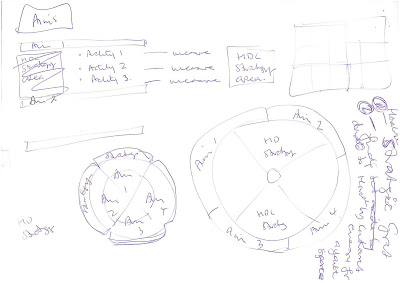 The text I was working with was:
- Council Strategic plans,
- Library Trust aims,
- Key activities,
- Operational plans and activities
- Key performance indicators.
I wanted to map Trust activity directly to Council strategy. Council are interested in governance not operations so I eliminated all operational data. This left me with a list of Council Strategic documents and a list of Library Trust aims.
Step 2: Mapping A to B
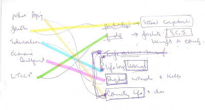 I 'tweaked' my list of library aims so that I ended up with a clear 1:1 mapping between the two lists. I dropped some Council Strategies which were not supported by Trust aims.
Step 3: Layout
Next play around with the sort of shape that would work for your data. One time I made a model like a lego construction with cyclinders resting on platforms. This was to illustrate distinct 'pillars' (focus areas of activity) that together formed a 'platform' of admin.
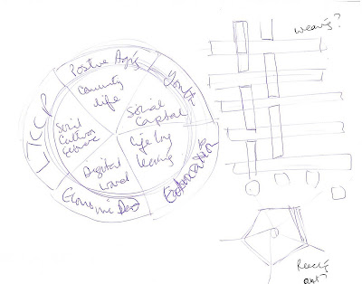 In this one I was playing with interweaving, perhaps using Council Strategies as the warp and Trust aims as the weft. Then I thought about library activity reaching out (into the community) from a strong (Council strategic framework) centre. I settled on Trust activities as the focus because it is OUR document. Council strategy is the background or framing.
Step 4: Mock Up
I liked this shape because the circle 'corners' bulge or flex out from a fairly 'prescribed' or focussed set of library aims (straight lines). The useful 'space' in the middle was formed from using square text boxes in triangles.
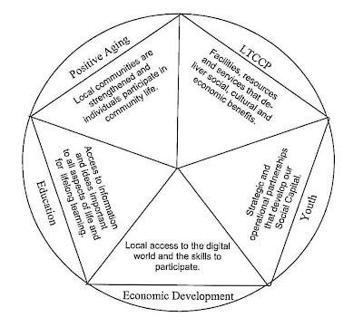 I use Microsoft Publisher for almost all of my diagrams, but sometimes Google Sketchup. (Actually to be totally honest, I take my pencil drawing and ask my 13 year old son to do it for me.)
Publisher as a format is a bit tricky but its a great creation tool. Think about negative space as well as positive space. Colours and fonts are really important too: some colours will make things pop off the page while other colours will help shapes 'recede'. When you have it all done select all and then save as a jpeg. This means you can insert it as an image in to any document.
Step 5: Finish
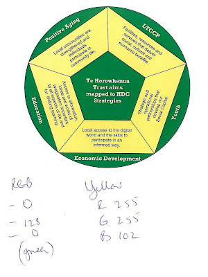 Also, jot down the colour 'formula' so you can match it with a colour scheme in your finished report.


No comments:
Post a Comment